HOMER Learn & Grow
As so many apps did around this same time, I was charged with leading the product team to consolidate our content and app experiences into an all-in-one app, designed to provide a comprehensive early learning program to kids aged 2-6.
As a team, we had to design an interface flexible enough to include different content types, different IP, and different subject matter. It had to align with how both parents and children navigate, evaluate, or engage with digital interfaces. Keep reading for our design processes and product decisions made.
Design by Holly Graham // Content & Learning Design by Samantha Creighan
Main Menu
Emotional Scheduling
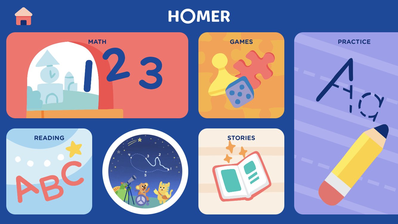
The main menu (pictured above) has to encompass a variety of content types for a variety of family use cases. Depending on who is initiating the app experience, families may look for content based on subject matter, or based on emotional scheduling, a phenomena where children inherently know their emotional state and the amount of time they have to play, and choose content accordingly.
For this reason, our main menu is divided into subject areas (math and reading, mainly to handle the parent use case), and into what we call “emotional scheduling categories” so that kids can find content that aligns with their schedule and current mood.
Main Menu Personalization
We know that kids at different ages play differently. Five year olds may be more interested in making progress, competition, and more typical game experiences. Two year olds, on the other hand, want delight. When they touch something, they expect rich interactions and are unwilling to wait. They likely enjoy songs more than the five year old “gamers”.
For this reason, we are able to personalize the main menu for specific age of the kid user, making it more likely for kids to find the content that is both developmentally appropriate and aligned with their interests and play patterns.
Direct-To-Content
Toddler-facing apps generally have a flat hierarchy and information architecture. Toddlers tend to tap and expect things to happen immediately, and don’t have a lot of patience to explore or consider options before choosing. In order to remove even more friction from the decision-making process, we added a button on the main menu to bring kids straight to a piece of content. This content was chosen and served up based on the age of the child and the developmental appropriateness of the piece of content.
This feature was designed to improve our stickiness metric. In combination with the launch of My Daily Plays (described below), our core engagement metric improved by 5% and continues to rise.
The circular button below is the Direct-to-Content button.
Design by Holly Graham // Content Strategy by Samantha Creighan & Rachel Kalkstein // UX Research by Danielle Francois
My Daily Plays
From a learning perspective, one of the major goals my team was faced with was how to have more kids complete a full learning progression, complete with a series of four lessons to Introduce, Practice, Assess, and Transfer a certain learning objective. In order to direct kids to appropriate learning progressions, we introduced a new feature called My Daily Plays.
When kids entered the experience, they were presented with a super engaging button, complete with a character that led you through the experience and encouraged you to come back and play again.
To complete this feature was a huge cross functional effort that involved our design team, our learning team, the content team, the backend engineering team, and the front-end developers. It required a lot of complicated logic and metadata tagging to ensure that kids were presented with content on their level and the correct sequence of lessons.
Design by Holly Graham // Content Strategy by Samantha Creighan & Rachel Kalkstein // UX Research by Danielle Francois
Design by Holly Graham // Content Strategy by Samantha Creighan & Rachel Kalkstein // UX Research by Danielle Francois


